JPMORGAN CHASE & CO · RESEARCH & DESIGN
Redesigning Search for Financial Research
Internal consumers of JPM Research asked for a better UI. Our own research showed the problem was in the underlying data.
ROLE
Product Designer; led discovery and co-ran the study
TEAM
Product manager, developers. Eventually, a dedicated UX researcher and a second product designer.
DESIGN + RESEARCH CONTRIBUTIONS
Introduce keyword search
Full page keyword-based results
Design system and accessibility updates
User interviews (informal and qualitative moderated sessions)
Coding and priority scoring of research
OUTCOME
The work moved to the Research department as an institutional initiative.
IN SHORT
01
The Ask
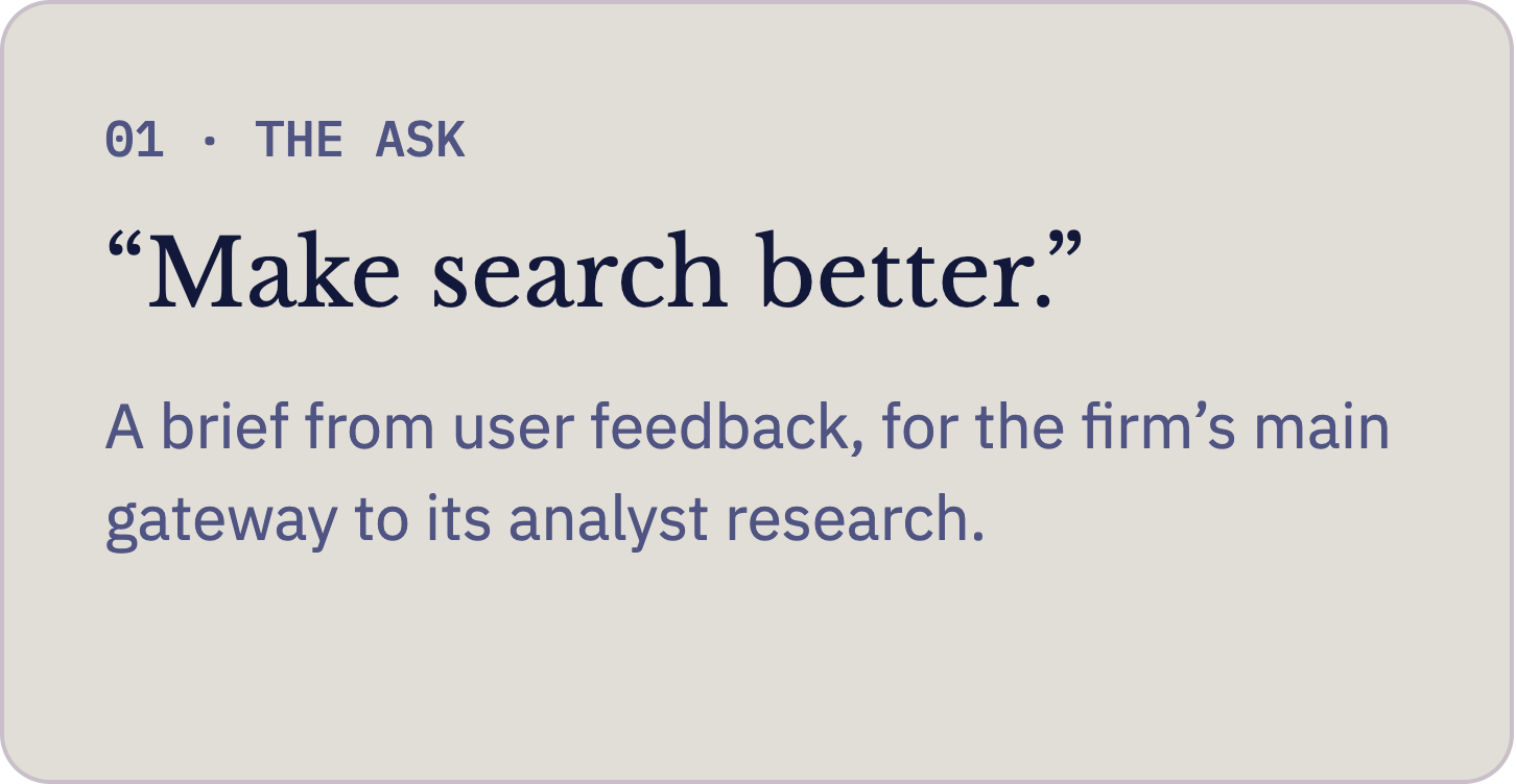
JPMorgan’s internal markets platform held the firm’s entire library of analyst research, and it was the main way people found research to understand the market and support trade ideas. The brief, from direct user feedback, was succinct yet abstract: make search better.
02
What I Found
The search bar was a glorified autocomplete over fixed categories, like analyst, topic, and company. Anything outside those distinct categories couldn’t be searched at all, so the tool only worked if you already knew who had written what. [Note: This was before AI-assisted search was an option]
Our largest proposed change was keyword search: one new row in the existing dropdown that could open a new, full page of results. We built it internally and tested it with real users.
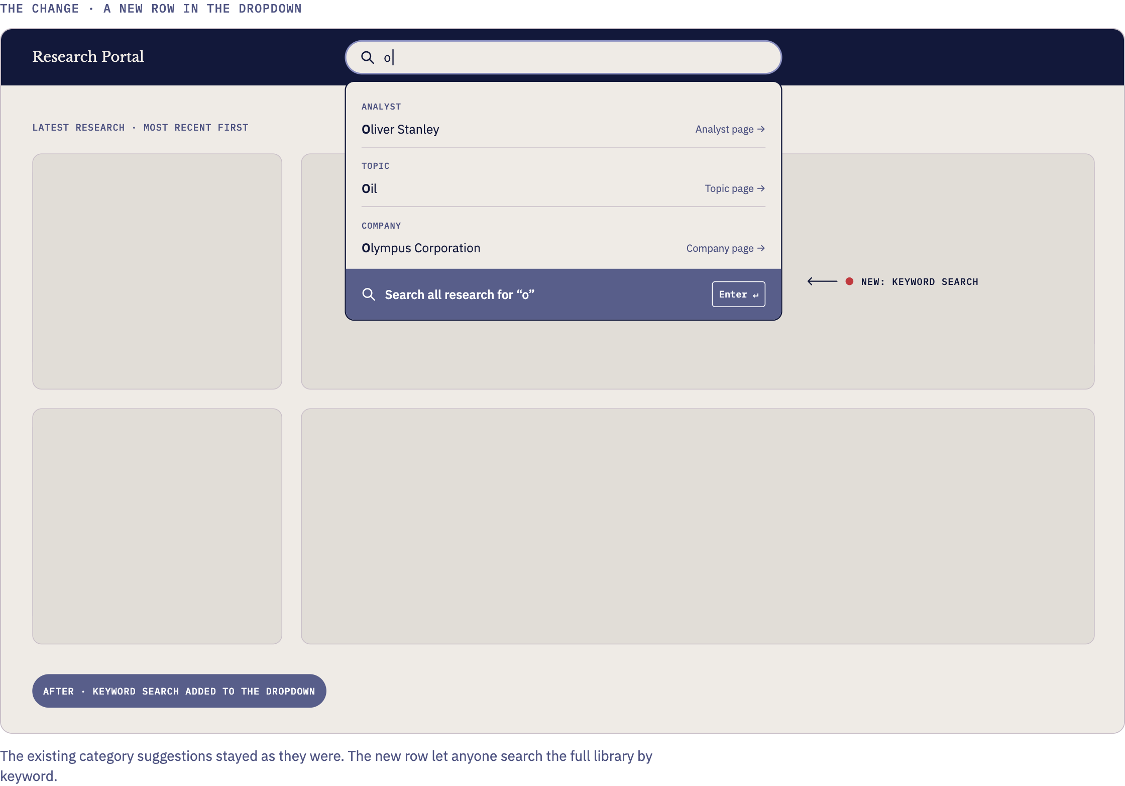
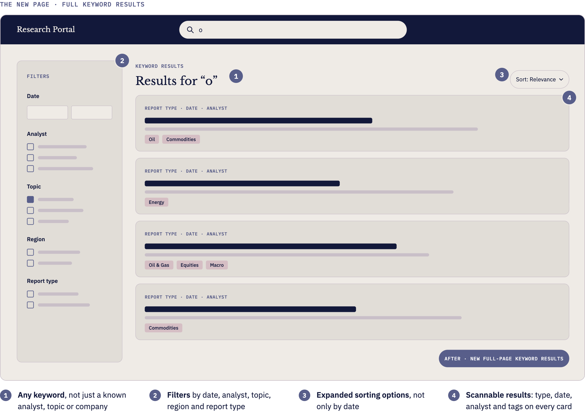
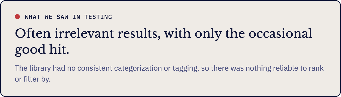
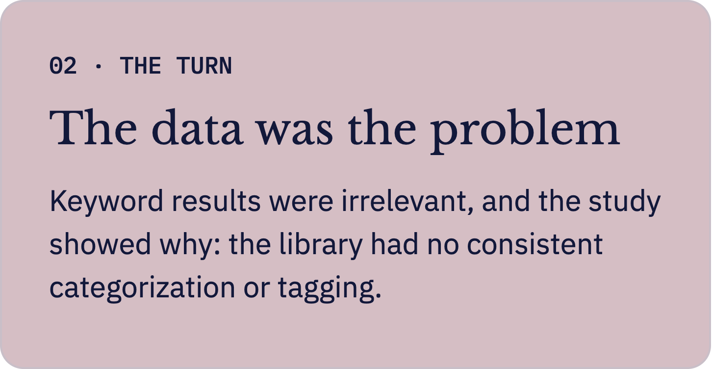
While the interface was ready, we found the data underneath wasn’t. This was our first evidence that a UI and feature upgrade might only fix so much.
03
Designing the Study
With a new product manager, the obvious next step was a bespoke search engine. Before committing to it, we agreed we needed to understand where search was failing, and for whom. The team brought in a dedicated user researcher and another product designer, and we built the study around three questions.
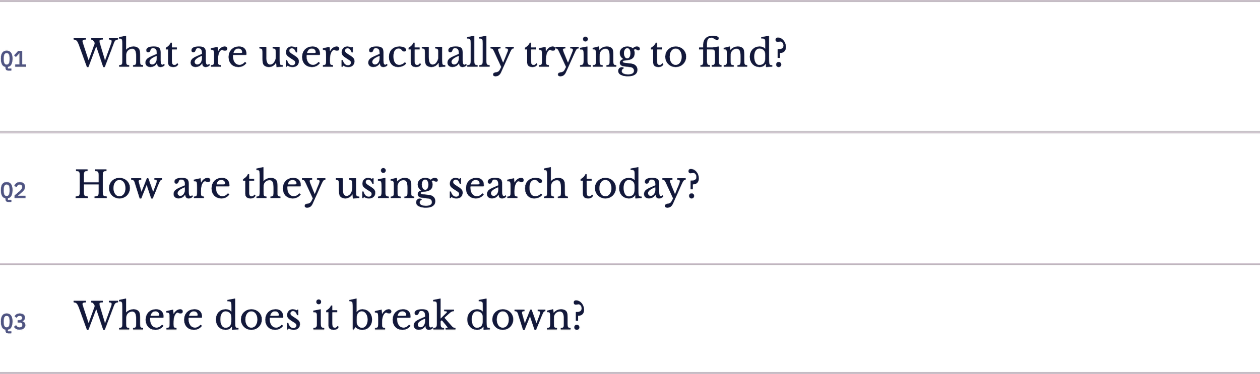
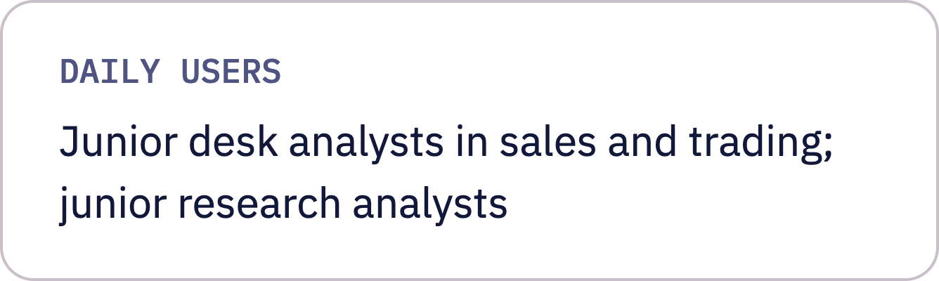
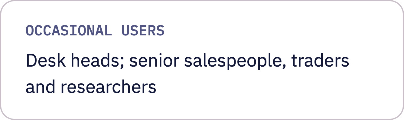
Format: Hour long sessions; we asked questions, gave tasks, and observed participants work on screen.
04
The Turn
A clear pattern emerged, and it turned on what users already knew. Junior analysts knew the authors and timing the menu asked for; senior users, often after a specific older article, rarely did.
We coded hours of video and transcripts, categorized every issue, and scored each on UX priority, business priority, UX effort and dev effort. The largest category, by a significant margin, was data organization and structure, confirming what the keyword results had suggested.
The search wasn’t the problem, per se; it was the data.
05
The impact
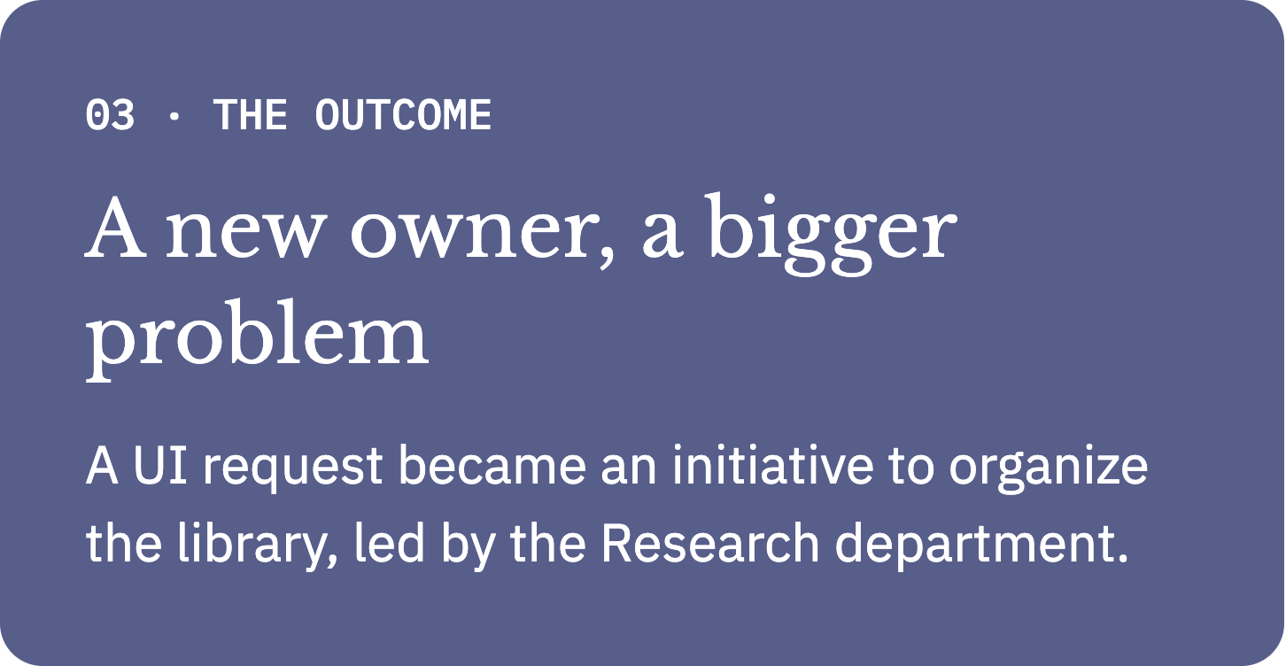
This finding changed the trajectory of the project. What started as a request to make search better became an institutional initiative to organize one of the firm’s most valuable digital assets.
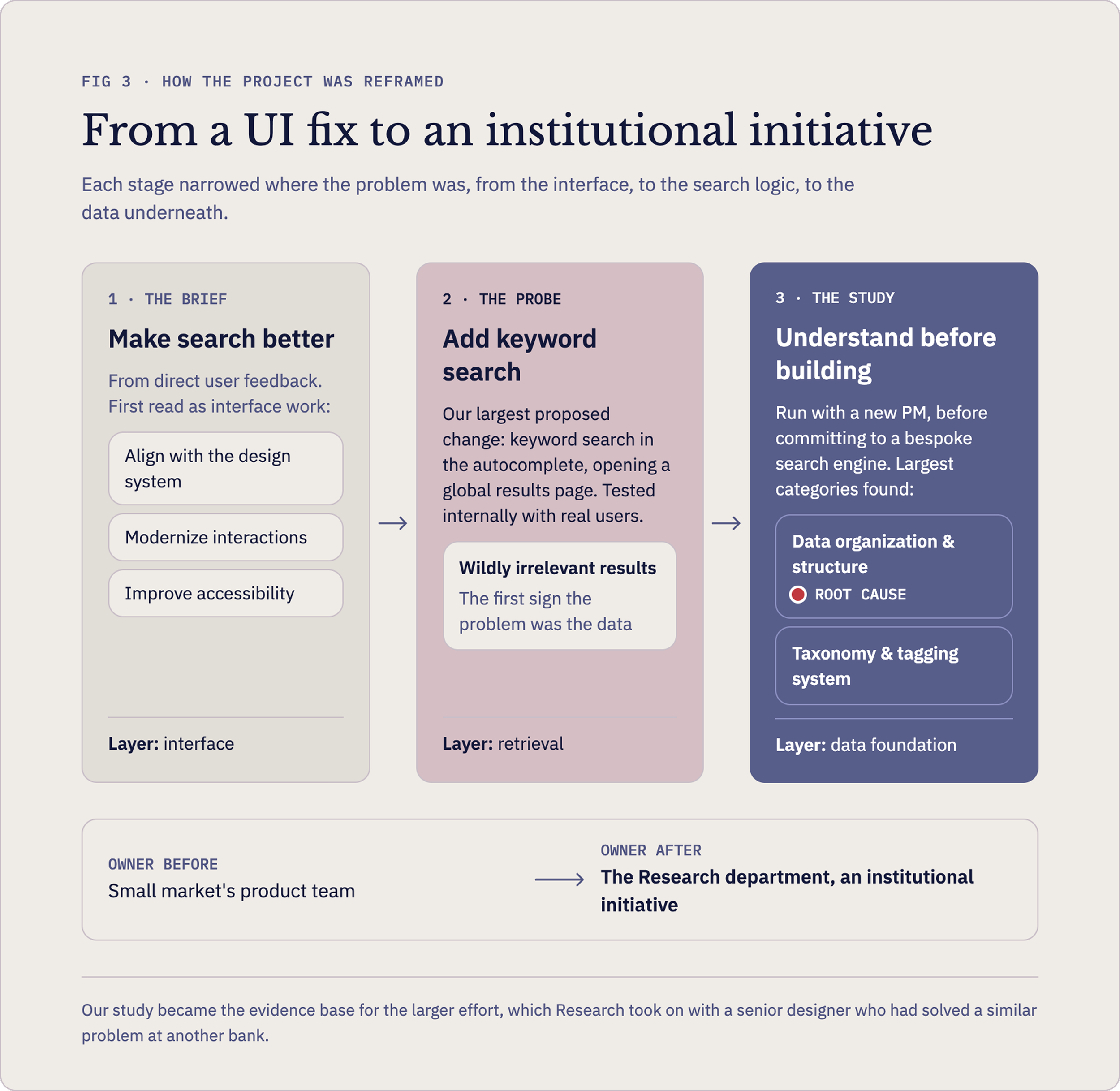
The work moved from our product team into the Research department, which partnered with a senior designer who had solved a similar problem at another bank. Our study became the evidence base for that larger effort.
06
What I Learned
One of my greatest strengths is accurately diagnosing the problem. Figuring out which problem will best serve both users and the organization is the part of this work I’m most drawn to. The keyword search didn’t fix anything, but it told us where to look.
It was also my first fully invested study with a dedicated researcher, and its rigor felt familiar from my time in the lab.