JOHNSON & JOHNSON · DESIGN & INFORMATION ARCHITECTURE
Redesigning a Navigation System for a Surgical Device Platform
Testing an existing and a proposed navigation to learn where users expect a task to live, and why.
ROLE
Product Designer & Researcher
TEAM
2 UX Designers
1 Product Manager
METHODS & CONTRIBUTIONS
Co-designed proposed navigation
Designed vertical navigation concept
Designed tree test study with Userlytics
Led most follow-up qualitative research sessions
Pathway task analysis across all 28 tasks
OUTCOME
Navigation update placed in backlog; the schema model is still the team’s reference
IN SHORT
01
The Problem
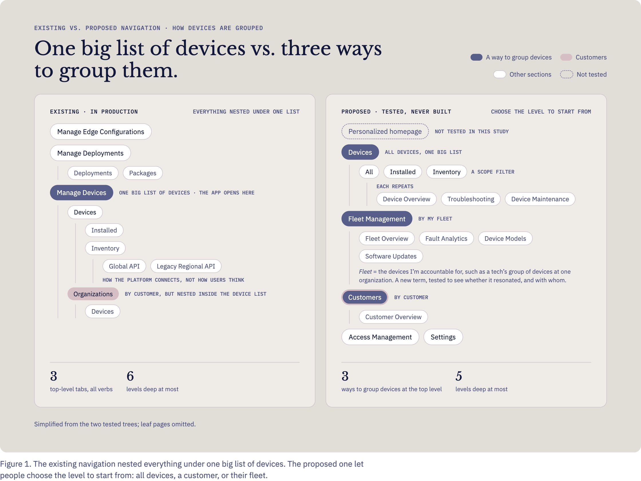
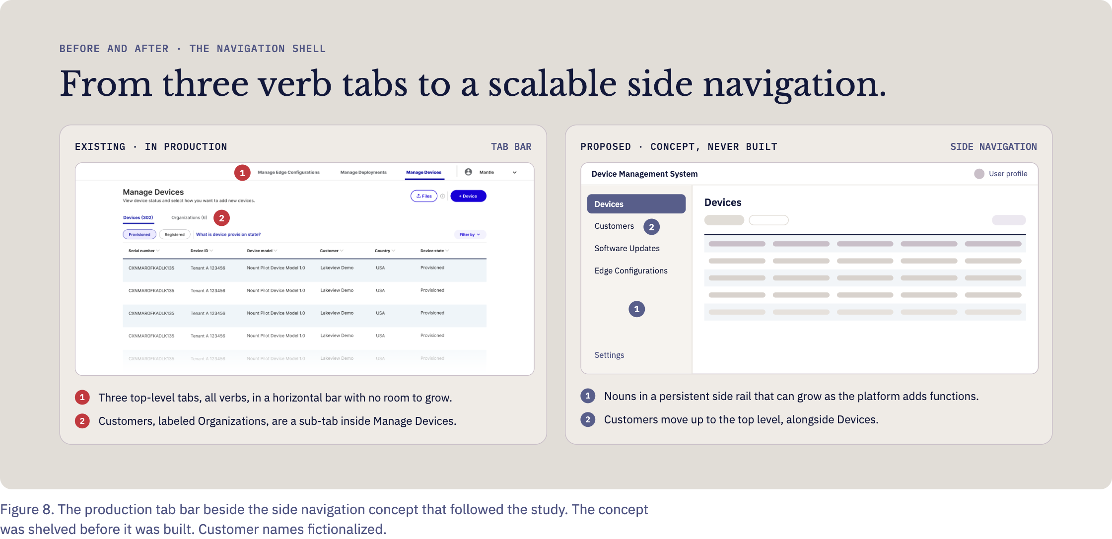
Mission Control is the application customers use to manage fleets of surgical devices. Its top-level tabs were all verbs: Manage Edge Configurations, Manage Deployments and Manage Devices. Nearly everything in a fleet tool is management, so the verb carried no information, and the tree routed almost everything through the device. Customers, labeled as Organizations, sat a tab below Manage Devices and three levels into the tree.
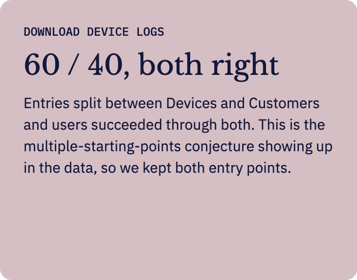
However, on platform serving several device lines and kinds of service work, the same information gets approached from different starting points.
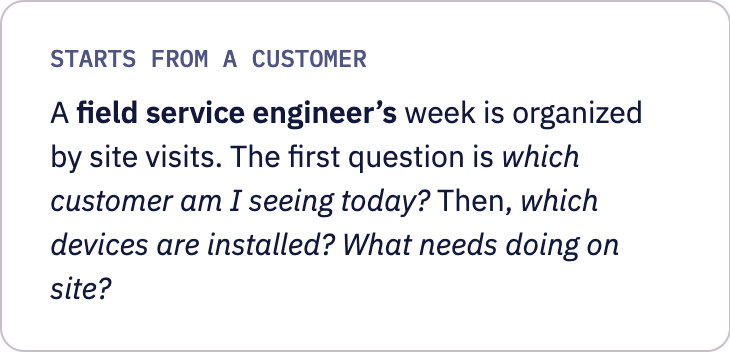
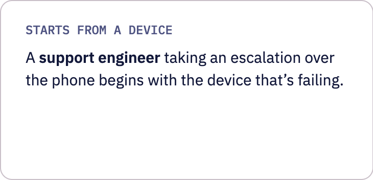
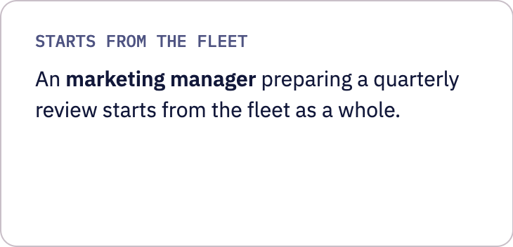
Our conjecture: give each starting point its own top-level entry (Devices, Customers, Fleet Management) and people could begin where their work begins. Half the tasks didn’t exist yet, so there was no behavior to observe, only expectations to map.
02
The Study
THE SAMPLE
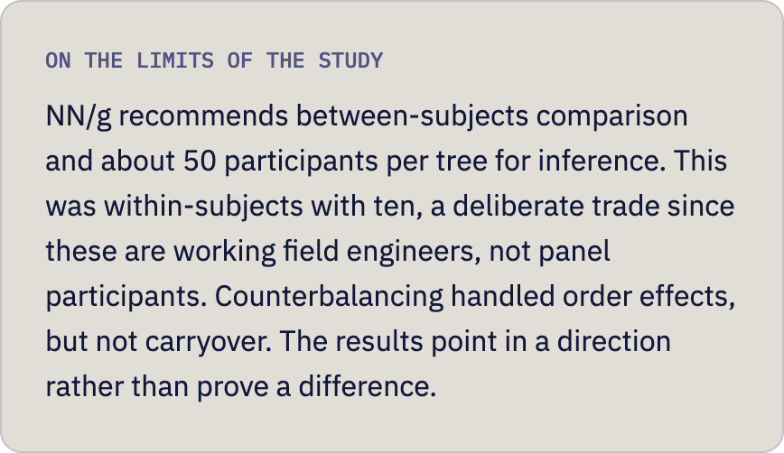
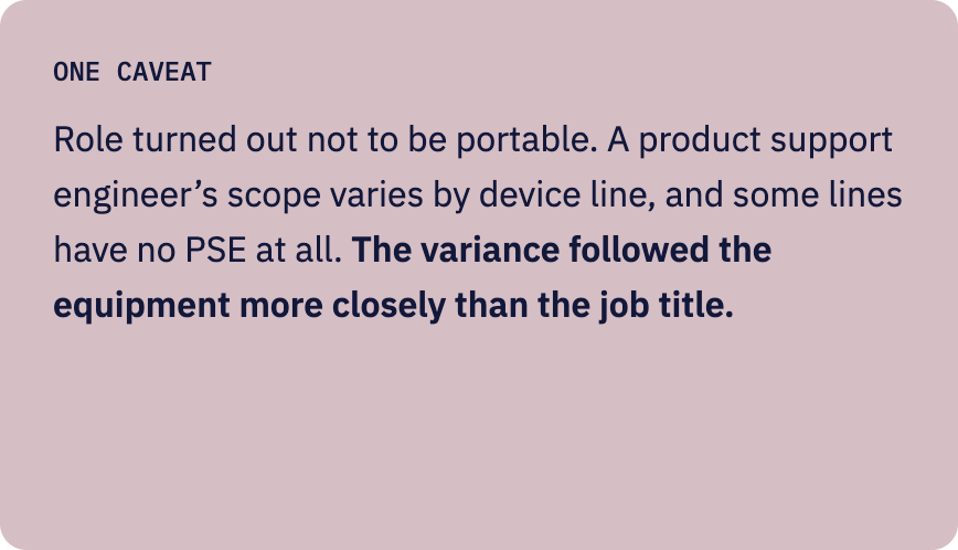
Ten participants, built across two dimensions rather than one: role (field service, tech support, product support, asset management, service center, data connectivity) and device line (Monarch, Mantle, Neuwave, Ottava). Given 10 users was never going to support significance testing, the study was sized to detect variance in schema, not effect size.
THE TASKS
Mapped against six functional categories and the roles that would hypothetically perform them, so coverage was deliberate rather than incidental.
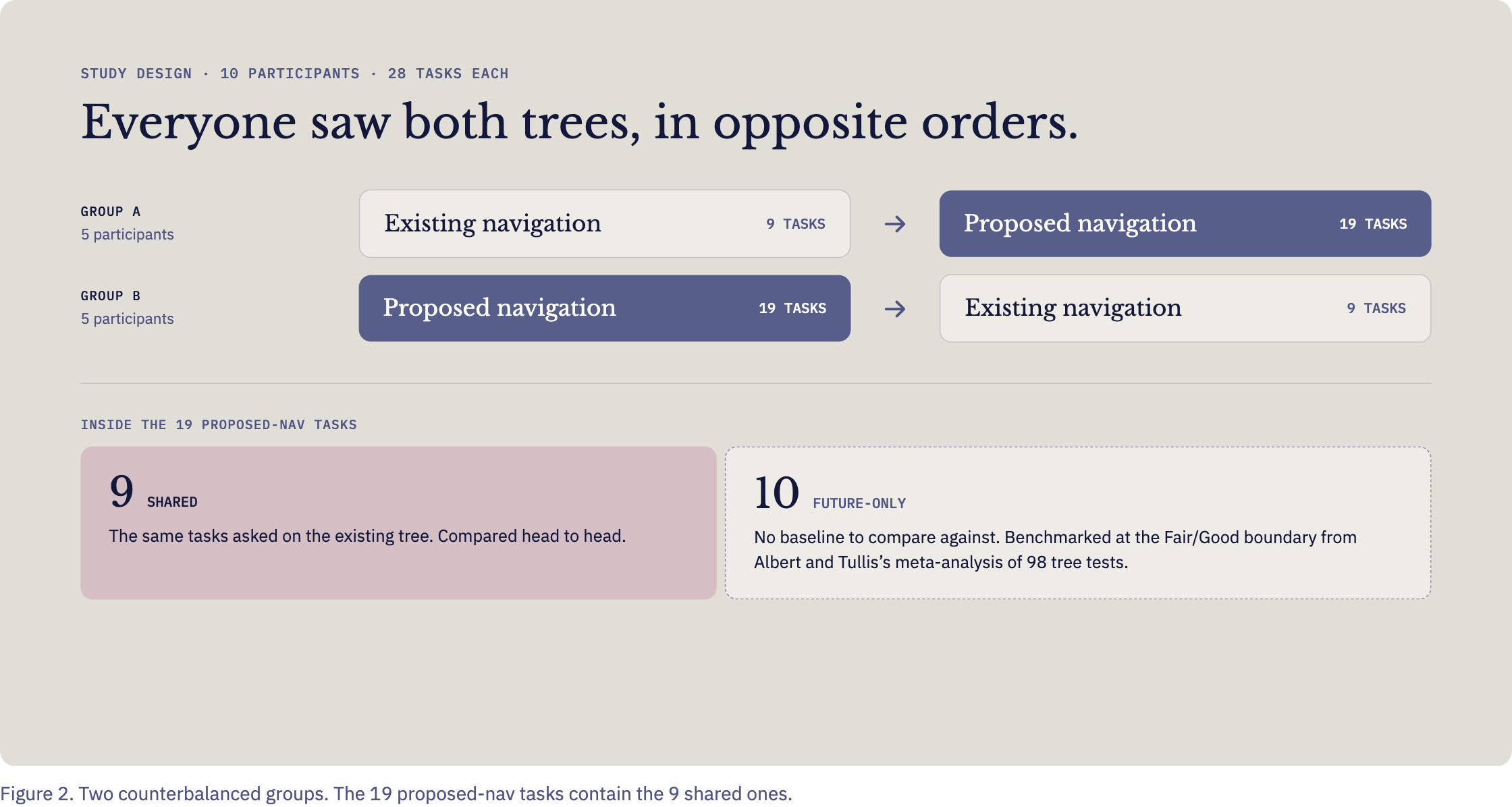
Each participant completed all 28 tasks: 9 on the existing navigation and 19 on the proposed one. Nine tasks appeared on both, asked once per navigation structure. The remaining ten existed only in the future-state architecture, so for those I used an external benchmark: the Fair/Good boundary from Albert and Tullis’s success score rubric.
03
The Analysis
The proposed tree scored higher on four of nine tasks for success and five of nine for directness. The existing one won decisively on creating an edge configuration, where a top-level tab made a rarely used function unusually visible, an advantage unrelated to which organizing logic was better.
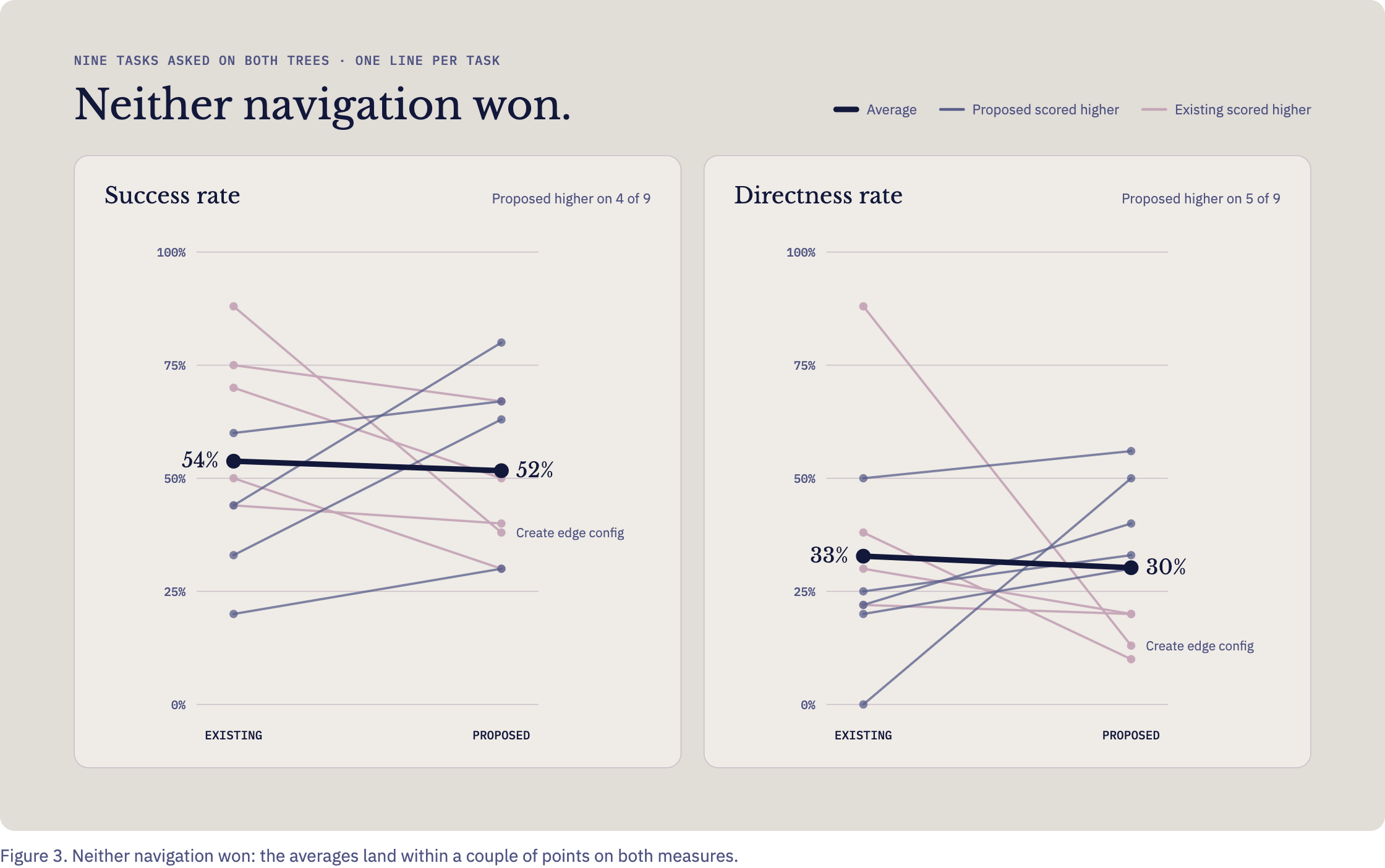
Reported on success rates alone, the study would have concluded the redesign wasn’t worth building.
So I stopped reading the averages and followed the paths.
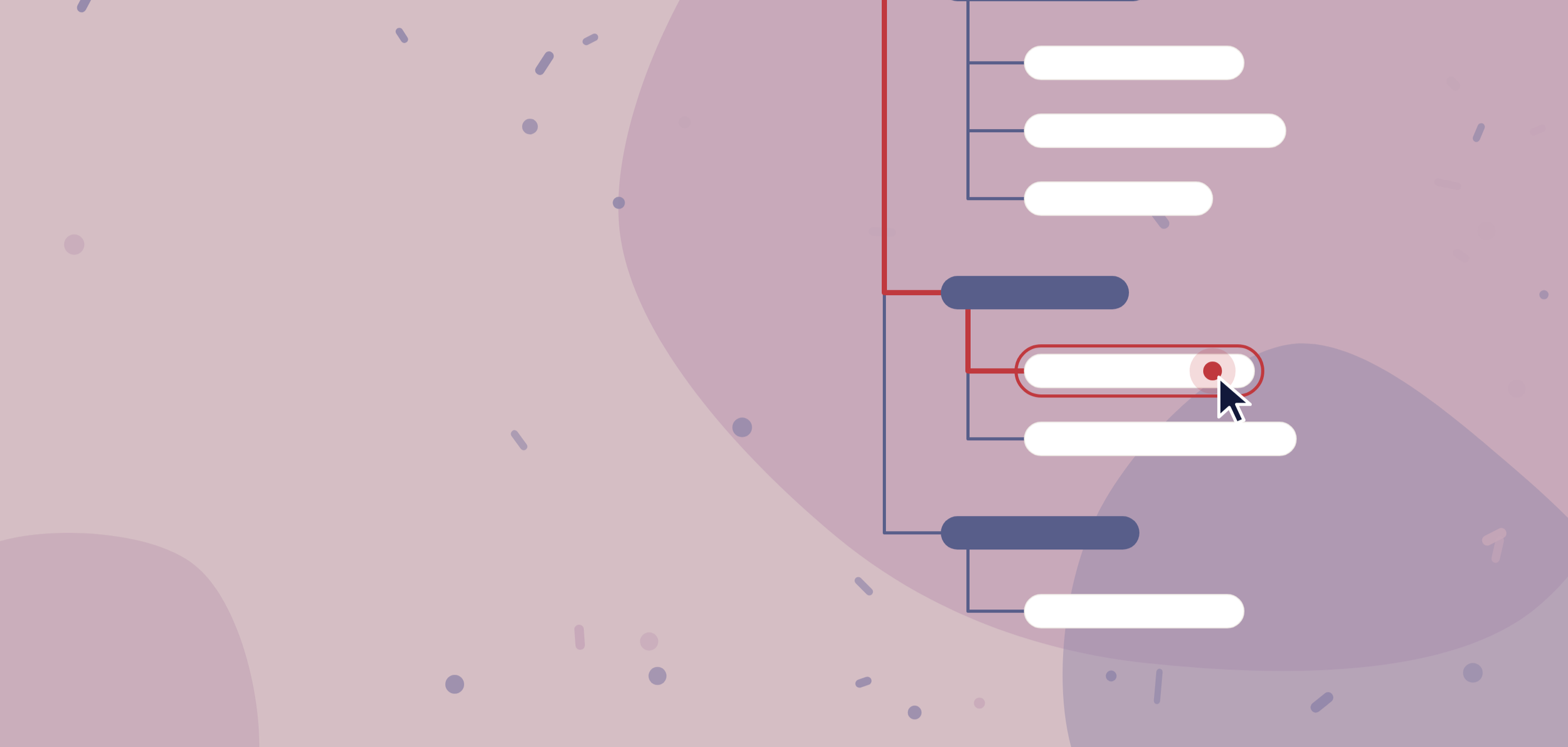
Tracing every task through first click → final top tier → final answer showed where users diverged, not just whether they arrived. I built that view for all 28 tasks, both trees, every participant.
04
The Findings: What the paths showed
STRUCTURE VS. LINGUISTICS
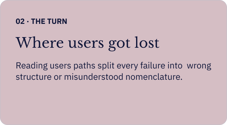
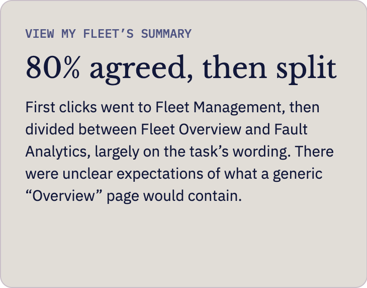
Failures came in two kinds. A tree test confounds labels and structure by design; splitting them says whether to move a node or rename it.
USER SELECTIONS THAT ARGUED AGAINST THE ANSWER KEY
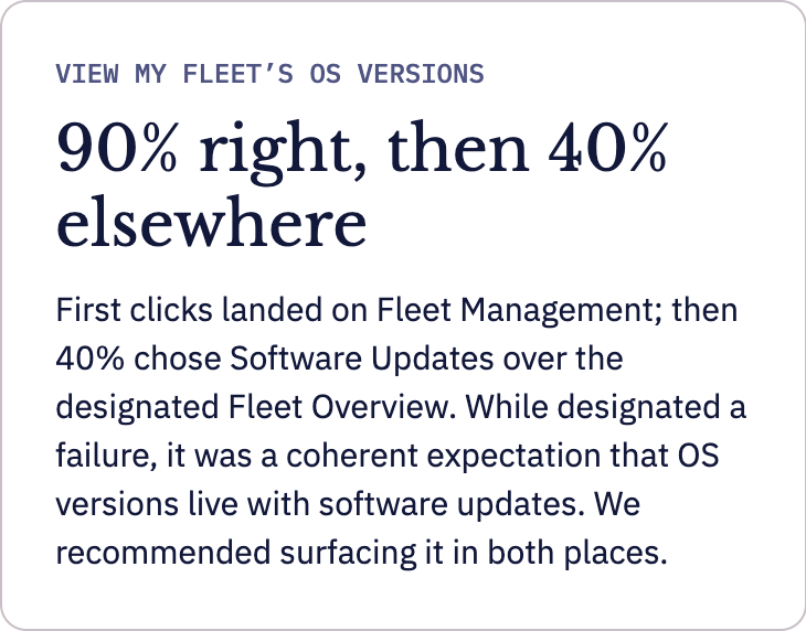
Tracing user paths also showed that some results argued with the answer key. A tree test requires you to designate a correct node in advance. Twice, the data suggested the designation was wrong. A third result argued against having a single answer at all.
05
What it Changed
While the new navigation didn’t ship, there are some worthwhile reasons and takeaways.
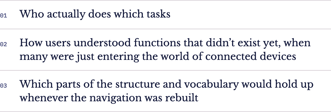
The proposed navigation was a conjecture, not a finished design. The research plan asked which structure performed better, but it also asked whether users could find where future tasks would live, and the tree was built mainly to answer that second question. A concrete structure gave participants something to react to, which made three things visible:
The team confirmed the horizontal tab pattern wasn’t robust and I was tasked with designing the replacement side navigation, including new components. While that was underway, product management concluded that the product’s real center of gravity was device troubleshooting. They used this study’s evidence of terminology instability in exactly that area to argue that troubleshooting needed dedicated research before it could be designed.
The navigation work was then shelved on my recommendation. An existing design system elsewhere in the organization had already solved side navigation and adopting it was a better use of the organization’s effort than finishing a parallel solution.

06
What I’d do differently